Monday 30 November 2009
Digipack Feedback from Group 45
We really like your DVD cover, the piano key on the spine looks really effective. We also like the combination of black and white drawing on the front of the DVD with the coloured image on the pack. Both products have continuity with the music video as similar images have been used. We like the DVD more than the magazine advert as we think that the transition between the drawing and the coloured image could have been a bit smoother on the advert, however we can see that a lot of effort has gone into it..well done :)
feedback
Has all the info that it should, could do with a website on the poster, Does promote the artist but can not see the face so still not sure what they look like, this make it more mysterious. Poster and DVD cover all have continuity which link to the images in the video, also same font and colour patten in all.
Peer Feedback On Digipack
DVD cover:
This cover has been composed and arranged well as all the information i would expect to find on a cover like this is on it. For example: name of band and title of song, name of record/publishing label as well as information in what is on the DVD (extras etc.)
It does promote the artist as he is on the front cover alone. The continuity is strong through the media forms as the style of image on the cover is the same as the music video which helps the audience notice the artist style from a distance or among other songs. There is also a web address on the back of the cover, 'fiveforfighting.com' which allows the viewer to look further into the band and possible tour dates or other singles/albums.
The continuity runs clearly throughout the three media forms through the use of the cartoon/ real life style used in the video. They also used the same font size, style and colour, which again help promote and make the band recognizable as well as boosting continuity.
Magazine Cover:
The magazine cover contain all relative information that is needed. Including, the Artist Name, Song title, where to purchase the song. The record label is also included. There is also a quote commenting on the song by a famous artist.
The artist is well promoted as there Artist name is largely written. It also contains the same style of writing including, font, style and colour. This makes it easy for the reader to recognise it amongst other music. This links with their continuity.
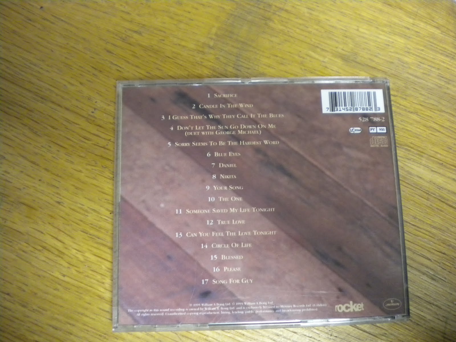
The continuity is strong throughout the digipak and the magazine cover shows this, by the similar image being used. The piano is also seen within every part of the digipak, showing this as a strong aspect.

Wednesday 25 November 2009
Poster
Here is the poster part of our DigiPack. The poster we have made using images from the video and applying opacity masks, gradients and text to them to generate a fantastic looking poster.


Monday 23 November 2009
Images of other soft rock album covers


As you can see from these album covers all of them are similar to each other as they are all sitting down and the main focus of the overall picture.
Monday 23th November - Digi Pack
Today we are gathering ideas for our digi pack we found that CD covers or posters for our slow rock genre generally shows the artist sitting down. We saw this with the Elton John CD which Jon brought in and for the album cover for our artist five for fighting Two Lights. Therefore we all decided for our album cover is to have Dan the main character sitting down next to a mirror and in the reflection you will see Dan and Jess but they will be animated. Therefore the mirror is the pathway between real life and animation. We are planning to use the Dance studio in college to take images for our Album cover.
Thursday 19 November 2009
Pictures of an example album cover


From this album cover we can see the variety of things we need to include in our digi pack. For instance, you can see a picture of the artist which is selling him well, inside cover shows lyrics so you can sing along and learn the words. There are also other albums inside to sell others. Finally, there is a list of what songs are on the track listed on the back cover.
Digipack analysis

The reason I picked this album, sleep through the static by Jack Johnson, is that it is a similar genre to our music video and so it will have points we have to take into consideration when creating our own digipack.
The main focus of the album cover is the artist him self playing his guitar and singing portraying to the person viewing the album that the music will main be him performing, this is further re enforced by having his name in large letters in front of the image and this take precedence over the album cover so that the artist is sold more than the album. The font used for the artist name looks like it could be his hand righting giving the cover a personal look.

The back of the album uses the same colour scheme as the front of the album, the blurred green, red and gray, allowing what ever is put in front of it to be the main focus this being the track list also fair prominently on the back of the album is statement that the album was 'recorded with 100% solar energy' and the symbol certifying this to be true. also there is the record labels logo, Brushfire Records, as to make most of the focus on the track list but the eye is also drawn to the ecological aspects of the album and the record label.


DigiPack analysis
I have analysed the CD cover of Paul Weller's Stanley Road Album.


The Front Cover


The reason that I picked the Stanley Road Album Cover to look at was the fact that on the main image it uses a cartoon style character and background.
The main image itself consists of a little boy crouching down by the road sign saying 'Stanley Road'. All of the image except for a small image of Paul Weller. This main image is something that we would consider doing for our music video DVD cover as the style of the music video is in the cartoon style similar to that of the 'Stanley Road'.
The Back Cover
The back cover feature 4 colours, Yellow, Blue, Red and Green. The colours themselves aren't all that important but the theme of the cover with the cartoon style as the colours look as though they have been coloured in by a child in a cartoon way. Also the text that describes what tracks there are on the CD cover look as though they have been handwritten onto the image. This again matches the overall style of the CD Cover.
The CD printing
The CD printing is very abstract in its styling, but it uses the 'Stanley Road' Road Sign and then spins the image to make it look really washed out. This continues the initial style of the cartoon effect with an image that makes you feel a bit dizzy which is a possible effect as the CD spins when it is being played.
The Artists Name

The Paul Weller text on the front of the cover is again in the cartoon style text. But added to this is the fact that they look like they have been cut out of a newspaper or text document to produce the effect for his name.
The inserted booklet

As you can see the inserted booklet continues the cartoon theme and combines it with images of Paul Weller and others in the process of making the album. Also it features various tributes and lyrics to the songs.
Feedback From T2-47
Genre conventions: Suits genre as the song is slow paced and video is slow and the cuts are long to make it effective. Performance from singer.
Lyrics & Visuals: The girl he is singing about is in the video, a girlfriend? Lip sync was in sync throughout the video.
Music & Visuals: Piano in video for performance, relates to song.
Demands of the record label: Lots of close ups of the main singer whilst performing.
Voyeurism: Voyeurism throughout.
Group 48 feedback on Final Video
This music video demonstrates genre characteristics through the divide between narrative and performance. The genre is very much a Ballet and the love story and the use of colour schemes portray this well.
We felt the relationship between lyrics and visuals didn't portray enough of the narrative, however the effective use of the female protagonist acting as his lover.
The relationship between music and visuals are very strong and the instrumentation is very appropriate.
The demands of the record label are met because the artist is sold throughout the music video. The emphasize and close-ups on the artists face and fingers achieve this.
The reference to notion of looking is not met but this is appropriate as the artists is singing to the female protagonist and not the camera.
Intertextuality we felt matched that of a magazine or painting, this is obviously through the sections of the video that are shown in drawings.
Feedback from Group 43
This video is very well created and very stylish. The genre characteristics are demonstrated by the music video. These characteristics are the general ballad piece accompanied by piano, which the video shows. As for lyric/visual relationship, the visuals go well with the music as when the song goes 'and i love her' the visuals show him and his girlfriend in love. There is a piano being played in the video which links in with the piano playing in the song.
There are a variety of shots, many include close ups of the artist.
Friday 13 November 2009
Finished converting the last batch of images
I have just finished converting the last lot of images for the music video.


These are the freshly filmed selection that we filmed earlier today.
On Monday all we have left to do is add these images in and add the new pieces of performance.
Then all thats left is to convert the video.
Here are a selection of images that have been converted
As you can see the file size is still pretty big
On Set - November 13th
Unlucky for some is Friday 13th. But for us it seemed to be quite a productive day with the final little improvements to our music video being filmed. We improved the lighting two of the narratives for the animation, the intro and exit parts which were just too dark to work out what they were.
We also filmed some extra shots to make it not quite so boring to watch the same shot for a long period of time. In these shots we have also incorporated some tracking to add to the overall effect.
Here are some pictures of us filming today in the Drama Studio:

We also filmed some extra shots to make it not quite so boring to watch the same shot for a long period of time. In these shots we have also incorporated some tracking to add to the overall effect.
Here are some pictures of us filming today in the Drama Studio:


Wednesday 11 November 2009
Another Animation Effect
Today alongside preparing the stars for one of our animation narratives we have also created another short animation with a slightly different effect. During our feedback of our rough cut we were picked up upon the faded amount of the animation making them hard to see. We experimented by overlaying a parchment effect on the images.
Here is the pencil effect animation
Here is the pencil effect animation
Here is the pencil effect with a parchment overlay animation
wednesday 11th October
Today we are continuing with finishing editing our photos for our animation by adding stars to the photos so it shows relationship between lyrics and visuals. Also we are also finishing our digipack.
Monday 9 November 2009
Filming improvments
When we film again we need to re-film the animation of of the performance with better lighting so that the animations work better, we will also shoot more performance shots to make the film more interesting as it will not always be the same shot and we will do more close up shots of the piano being played,and we will change the lighting of the over all performance will be more clear.
Week Schedule
Today : We are going to finish our digi-pack and add stars to our animation.
Wednesday : We are filming any extra footage that we need at 1.05 - 4.10pm
Thursday : On thursday our group is coming in to edit our music video 5pm - 9pm
Wednesday : We are filming any extra footage that we need at 1.05 - 4.10pm
Thursday : On thursday our group is coming in to edit our music video 5pm - 9pm
Wednesday 4 November 2009
Feed Back Response
We will do some more film so that we can get some more varied shots for the performance part of our video and make the video more interesting as well as this we will also film the in side animations again with more light show they are not as light and so more visible, the way we will make the characters in the video mare defined we will export the video at a higher quality.
Monday 2 November 2009
Roughcut Feedback
I thought that overall your roughcut was really good and flowed very well. I think that the lighting in the shots of the boy playing the piano was really effective and fit in well with the feel of the music. However i think the shots showing the boy playing the piano could have been varied a little more as it got quite boring watching the same shot over and over again.
The editing of the footage that is made to look like it is a pencil drawing has worked really well but it seems to be a bit faint and might look more effective if it was a bit darker so that it would show up more.
I think that the video has followed all the genre conventions and sells the artist really well, you've done a really good job :)
Feedback on rough cut
Really good, good use of goodwins points - genre wise, the editing cool but i didnt really like how liht the white bit goes, you cant really see the characters. There are many, different and interesting shots, they could be better. i would watch it again but only because of the song not the video. links with the blog. Sells the artist really really well!
Group 48 feedback on roughcut
From watching your video we have concluded that your idea is good, you just need to expand on it a little bit more. Your lip syncing and shots of the artists are really well done, but there is quite a lot of the same shot. More variate shots would liven up the video from a views point of view. Also the shots with the white are quite hard to make out, again its a good idea but maybe some expanding upon it would be good.
Hope that helped.
Hope that helped.